AI
3 min read
July 3, 2026
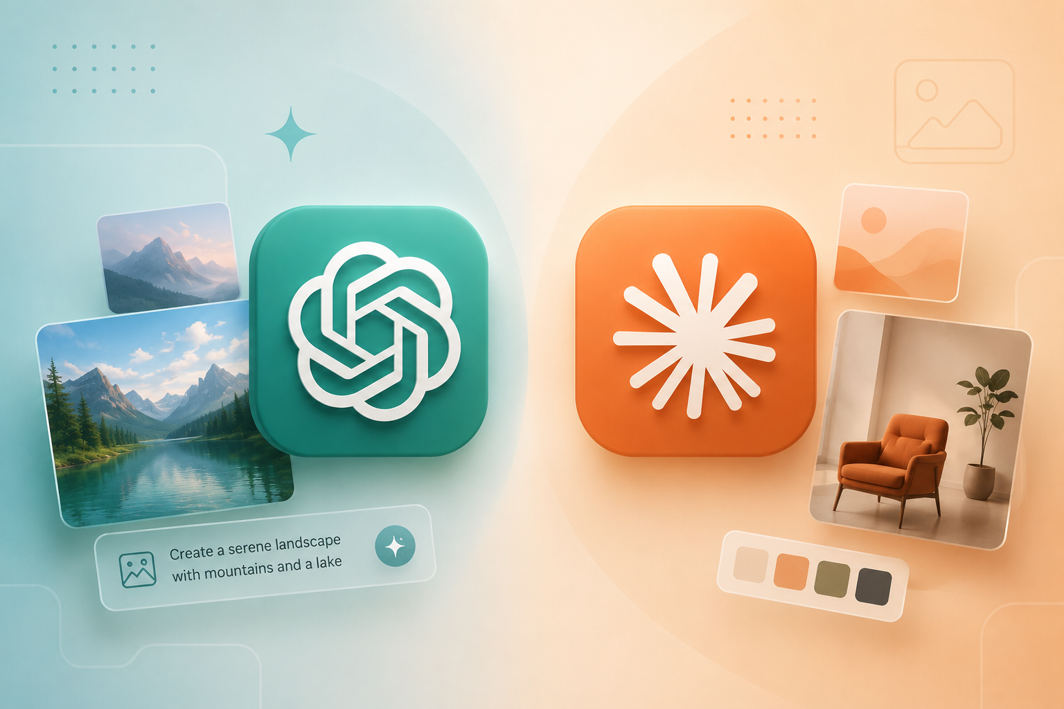
Last month’s ChatGPT Images 2 release has effectively solved text rendering inside AI-generated images and removed most of the visual ‘tells’ that gave them away in the past. Claude Design generates on-brand design assets by reading the code of your website and matching outputs to the existing style. Both shipped within the same week in April 2026, and together they mark a step change in what AI can produce for design, comms and training work.
• ChatGPT Images 2 produces correctly spelled, properly laid-out text inside images, solving a problem that has plagued AI image tools for years.
• Photorealism is now strong enough that the old visual signals (weirdly smooth skin, plasticy light) can no longer reliably identify AI-generated images.
• Claude Design intuits your brand from your website’s code, so the output fits your business’ existing stylistic parameters.
• Both tools still get physics and real-world logic wrong. Kitchens with two ovens, that kind of thing. Human review is still important.
• The implication for credibility, comms and design work is significant. The framework for spotting fake images is no longer reliable.
ChatGPT Images 2 is OpenAI’s updated image generation model, released in April 2026. These are the two practical leaps it presents over previous image models:
Text rendering is essentially solved.
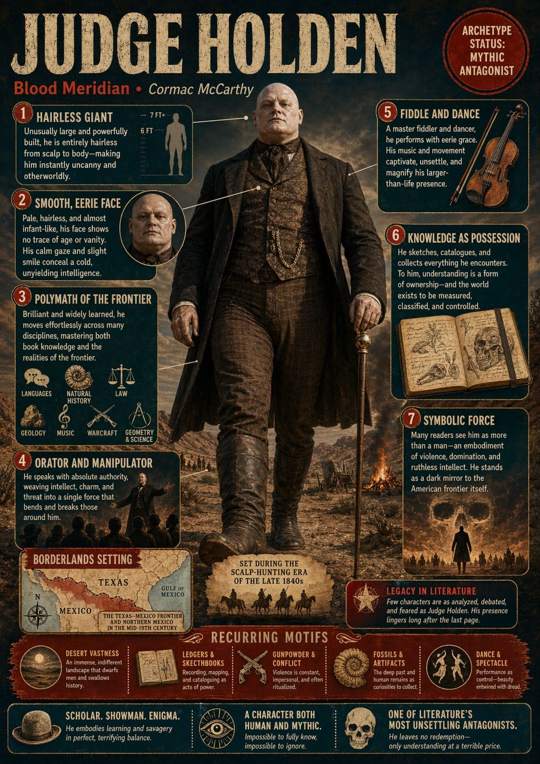
Until recently, asking AI to put words inside a picture was a roll of the dice. Letters morphed mid-word. “Coffee” might become “Cofiee” or “Cofeefe.” Shopfront signs would be smooshed into something that looked vaguely like English filtered through a hangover. That made AI-generated infographics, posters and packaging functionally useless for most professional work.
That problem appears to be over. I asked GPT Images 2 to make an infographic of my favourite literary villain, Judge Holden from Cormac McCarthy’s Blood Meridian, a character whose entire menace lives in long, dense paragraphs. It produced a one-page graphic with hundreds of words on it. All correctly spelled, properly kerned and laid out in a way a designer wouldn’t be embarrassed by. No alien hieroglyphs or mystery added lines between letters. It’s a clear step beyond Nano Banana 2, which was already impressive.
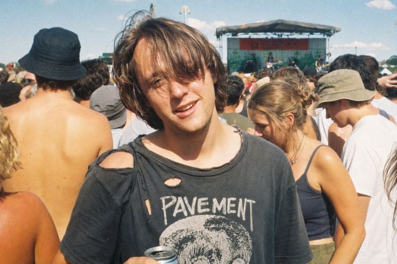
The plastic sheen is pretty much gone.
Photorealistic AI images have always had a soft, plastic over-polish that gave them away. The skin is usually too smooth and the light too even.
I prompted GPT Images 2 to produce a photo “taken on a disposable camera at a music festival in the 90s.” It produced exactly that. Grainy, slightly off-colour, the kind of photo that would have lived in a shoebox under your parents’ bed. Not a bad resemblance to me either, which is alarming. Close enough to fool my wife!
The visual signals that we rely on are eroding faster than most of us are updating our instincts.
For the past two years, comms teams, journalists and educators have leaned on visual shorthand to spot AI-generated content. This is only going to get harder. Some of the implications include
Physics and real-world logic.
I gave the model a series of photos of my living room and asked it to imagine a renovation in contemporary Japanese style. It produced nice concepts and stylish depictions. But one of the kitchens had two ovens, sitting side by side with no reason for being there. A small mistake, the kind of thing the model has no intuition for because it doesn’t know what an oven is for or how it fits into the context of the design. It just knows what ovens look like.
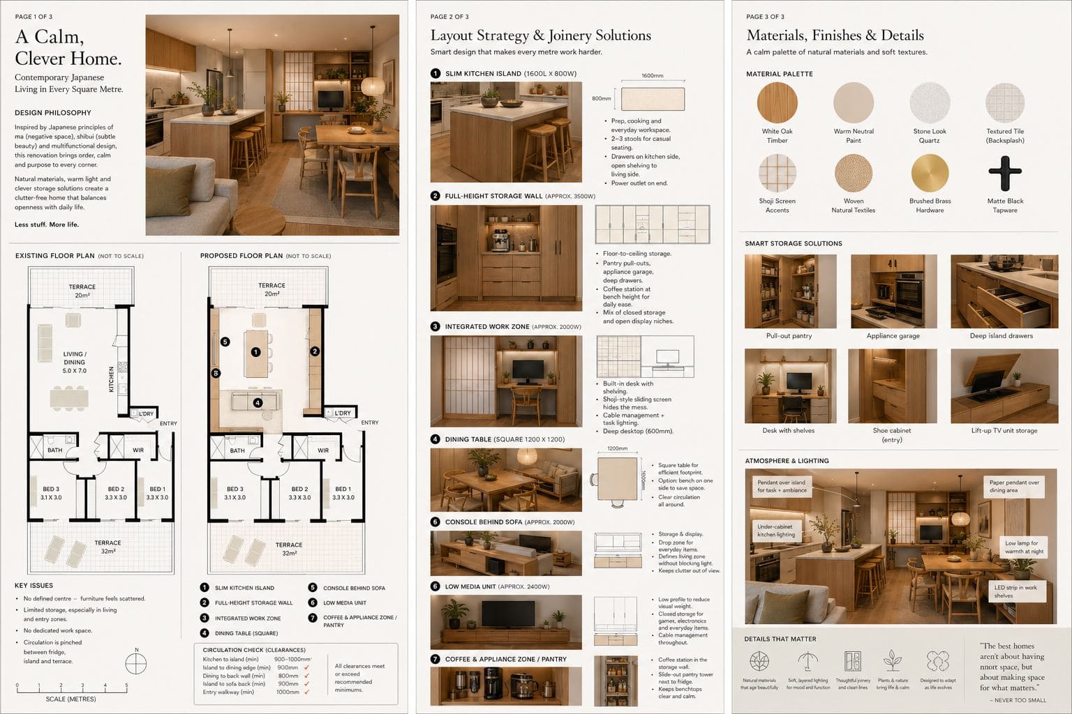
So, AI image generation is now strong on style, mood, lighting and composition but it’s still weak on physical sense. How many of a thing should be in a room, how furniture works, how a real space is occupied and experienced. For now, anything you create needs a human eye for exactly that reason.
Claude Design is Anthropic’s design tool, released in April 2026. The thing that sets it apart from other AI design tools is that it can read your website’s code directly and infer your brand from it.
You point it at a URL, it checks out your colours, typography, spacing and starts producing on-brand work without you having to write a brief from scratch.
Three features that stood out from a week of using it at the AI Training Company:
• Sliders for style adjustments. Instead of regenerating an asset until you get lucky, give it a nudge. Maybe you’d like more colour, less colour, more text, less text.
• Comments on page elements. You can mark up a generated piece the way a designer would mark up a draft. “Change this section.” “Push this further.” It treats the output as a draft ready for updates.
• Style intuition from code. Because it reads your existing site, it doesn’t produce the generic AI look. The output instead feels like an extension of your existing brand.
There’s a big opportunity here for any organisations that produce a lot of internal materials, training, comms, decks, course content, social tiles. Claude Design is already cutting a meaningful amount of time off our process at AITC.
The teams that will get the most out of this generation of tools will be the ones who notice what’s changing between releases. What’s now possible that wasn’t a month ago, what shortcuts are no longer worth taking, what skills matter now?
Image rendering is solved, brand-aware design is here and the visual web could look very different by the end of the year.
If you want to talk about how to work this into your team’s actual day-to-day, beyond the demos, that’s what we do at the AI Training Company. Get in Touch!
Shaun is the founder of The AI Training Company. AITC runs hands-on training for organisations that want their teams using AI well, not just using it.